

THE PROBLEM
 Role
Role Product Designer, led research and presentation
 Tools
Tools Figma, Figma Make, Card sorting, Maze
 Deliverables
 Presented findings & prototype to NTU PACE Executives
IMPACT
 200k - 1.2M est. recovered revenue
 THE GAP
Learners search by goal. NTU organizes by department.
.
.
.
Confusing labels
11
12
Lost on “FlexiMasters,” “Stackable Certificates,” “Professional Executive Certificates”
"I don't know what all these categories mean."
– M, Aerospace Engineer

Poor Navigation
> 50%
Couldn't find courses by outcome
No Memory

No way to save and return
1.
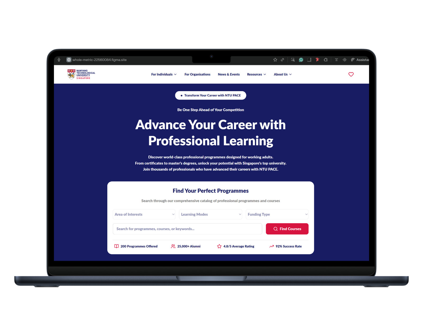
Match structure to how people search, not how NTU is organized
- Goal-based hero search replaces department categories
- Users start exploring immediately in a way that matches how they think

 72s
72s


 1.7/ 5
SOLUTION
2.
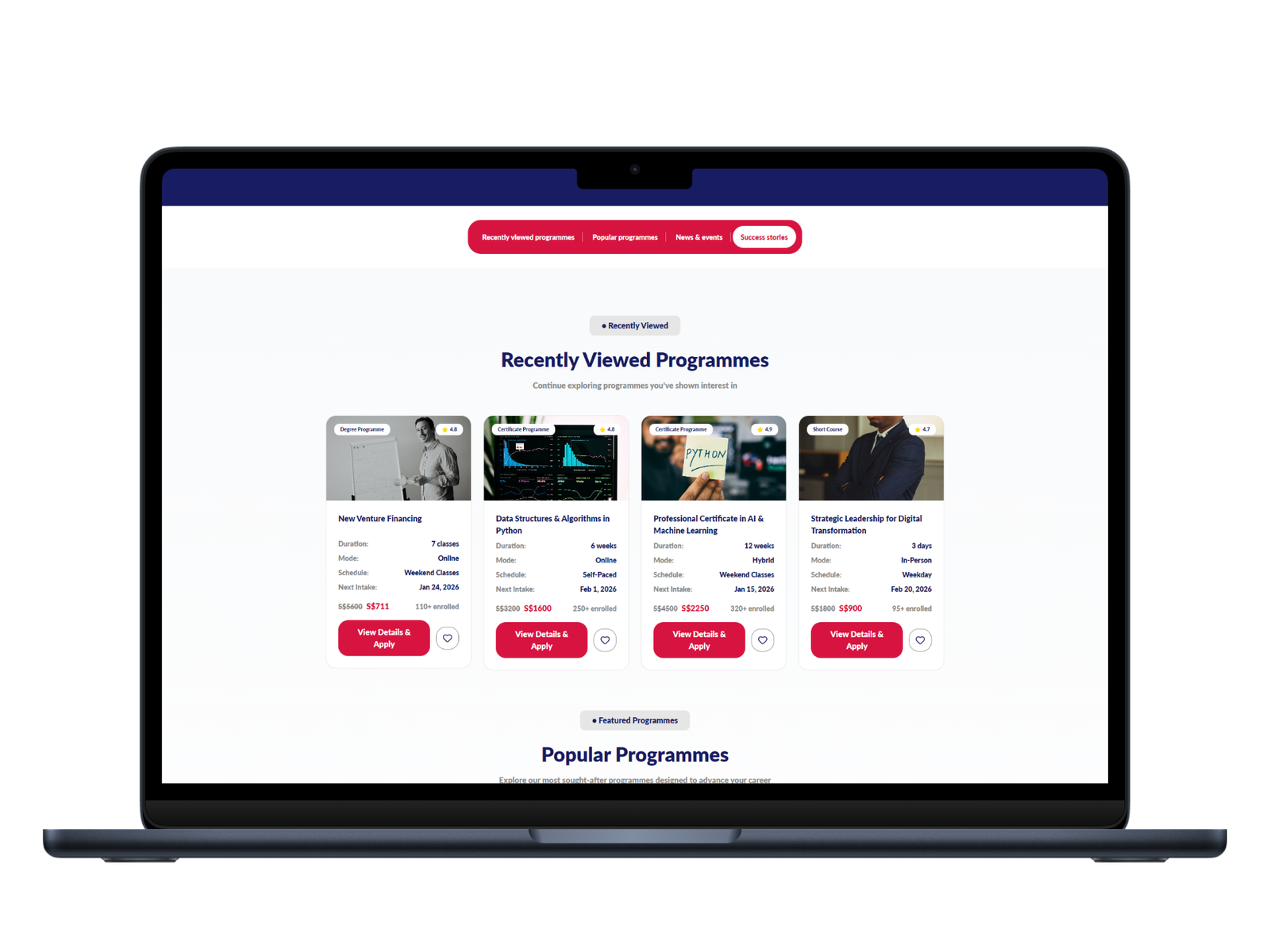
Remove the re-orientation cost
- Sticky header: key sections stay visible
 53.3%
53.3%SOLUTION
3.
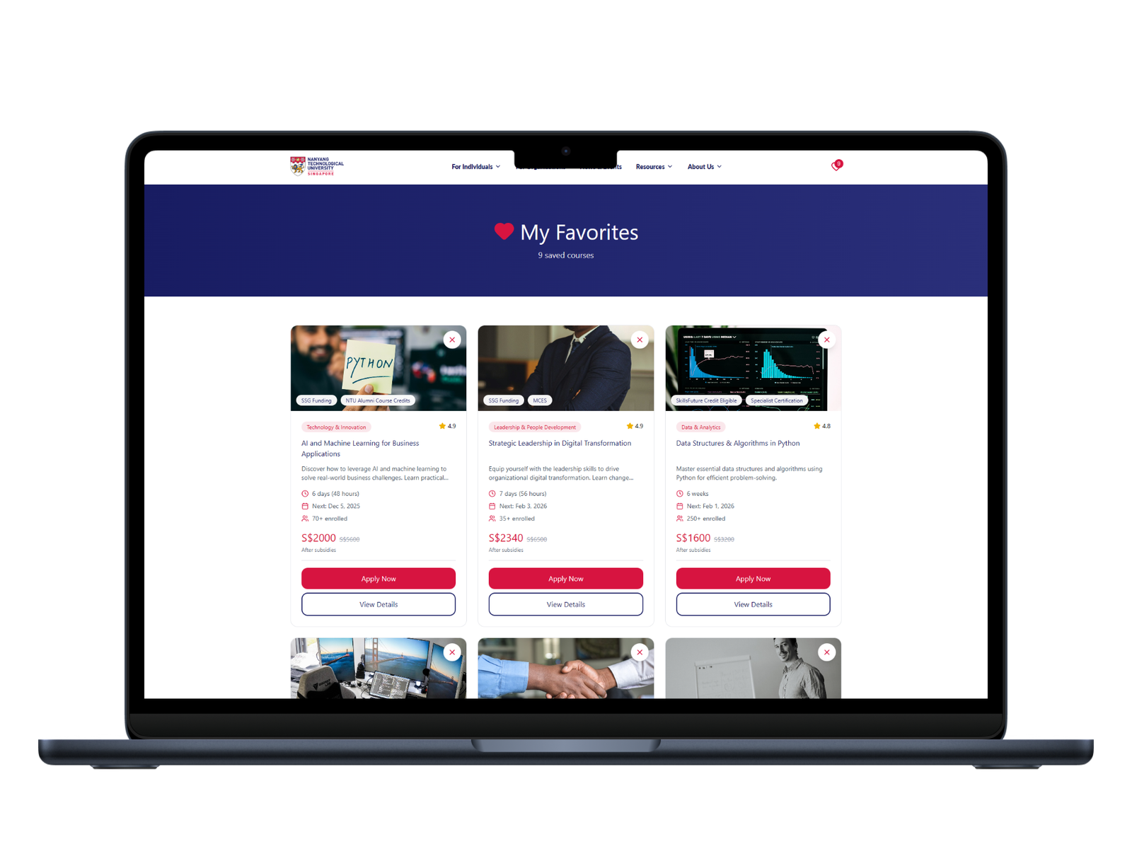
Decisions span sessions, not one visit
- Save courses, no sign-in required


SOLUTION
THE TRADE-OFF
Not every tested idea made it in.
Proposed: a preview overlay
A hover/tap preview so learners could see key course info at a glance, no new page or tab.
Cut after testing
Barely used in testing, and it added an extra click of its own, the opposite of what it was meant to solve.
Good user research cuts your own ideas too, not just the ones you're testing on someone else's behalf.
BUSINESS
IMPACT

WHAT I LEARNT

- Prioritised structure over personalization — highest leverage, given timeline
- Card sort exposed a mental-model gap the institutional team missed
- Untested assumption: does smart search get used, or does everyone default to browsing?
 LinkedIn
 ncuxd@outlook.com